In Living Color
Several weeks ago, I cleaned out my closet. To use a fancier term, I performed a “closet audit.” I followed a formula that I learned from Rosanna Vollmerhausen and Lani Inlander, two prominent D.C.-based stylists, and I’ll be the first to admit the results are dramatic. I was pretty proud of myself once I finished and took a literal step back to view my re-invented closet (insert back-pat here?). Though a significant effort, my newly streamlined closet is a time-saver as it’s less cluttered and, given that my clothing are shoes are neatly organized, much easier to navigate.
Since he is constantly looking to organize and get rid of “stuff,” I decided to make a point of showing my husband the fruits of my closet-organizing labor. He lives by Marie Kondo’s KonMari method, so if you’ve read her book “The Life Changing Magic of Tidying Up” you will understand why I was excited to show him. As predicted, he was glad to see that my clothing and shoes were no longer, well, everywhere.
His next comment, though not surprising, struck me. He said, “Wow, your whole closet is black!” and he was right.

Over the last several years I have continued to gravitate towards black and solid neutrals. You can find about five printed items in my closet, and while the color palette is slightly broader than just black, it only includes other neutrals — olive, blush, cream, navy, and, of course, a lot of denim. I’ve thought about why this is, and I think I have the answer: as I grow older I feel like I’m “on display” when I wear bright colors or prints. For some reason, I just don’t feel so comfortable in them anymore. This isn’t to say I don’t like color or prints. I love them…on other people! I’ll often comment on a gorgeous print or how well a bright color accentuates a friend’s overall look. I also know there are certain bright colors that pair well with my skin tone. I don’t have an aversion to color or print; it’s more so how I feel when I’m the one wearing them.
As we get into the dog days of summer colorful clothing and accessories are everywhere. Sunny yellow is the color of this summer with vibrant red very close behind. Floral gauzy dresses and billowy printed off-the-shoulder blouses are seen on many women in Alexandria and look great, even in the sweltering heat. I thought about all of this as I walked into Kiskadee a few weeks ago to research my next Stylebook piece.
Predictably, I made a bee-line to an olive A-line shirt dress and black crepe tank, but then I stopped myself from even pulling them from the rack. I literally did a 360 and realized that most of the store was filled with bright, cheery color. And it’s summer! And the sun was shining! It was then that I decided I was doing this piece “in color,” and stepping out of my comfort zone. Bright colors and prints — bring them on. Black and neutrals will certainly return, but now was the time to immerse myself in the colors of the season.
The three looks I chose are all dresses because to me dresses are the perfect solution to look put-together in crazy summer heat. While I can’t say I’m going to wear bright colors or prints every day, I can tell you that I bought (and have worn) the dress in the first look below! Baby steps…to living a bit more of a colorful summer!

I’m not sure if a singular piece of clothing can scream “summer” any more then this colorful and forgiving gauzy dress. The off-the-shoulder accentuates what I think is such an elegant part of a woman’s body, the collarbone, and the added fringe and tassel trim make it fun and festive. Even though it’s not solid red, I thought of the dancing lady emoji in the red dress when I wore this on vacation in Mexico! With a pair of nude wedges and little else, it’s the perfect dress for a hot, summer night.

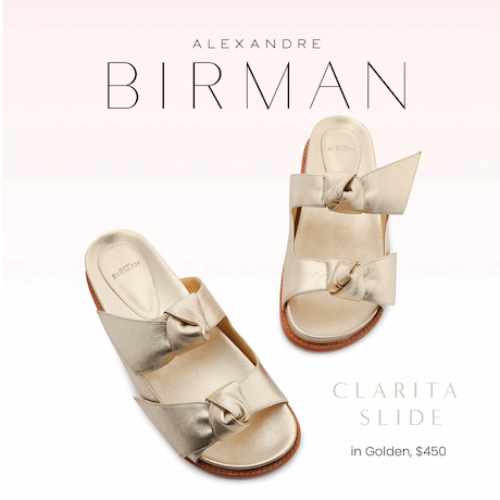
BCBG routinely plays with cuts and draping in interesting, yet subtle, ways. This dress is no exception. The red and white overlay drapes to expose a red slip underneath and darts at the waist provide added shaping. The all-over print works to confuse the eye, and provides an overall streamlined silhouette. I gravitate toward pieces with interesting cut and design details such as this one. The bright color and print steered me towards neutral metallic sandals with a twist, as the added interest of ankle wraps and a cylindrical block heel adds another design element to the look.

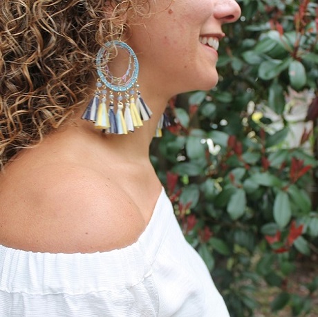
I love denim, and the blue tones in this dress remind me of various colors of distressed denim. The simple silhouette with exposed shoulders seems to juxtapose well with a busier print. My latest color crush combo, one that I’m trying to explore and incorporate into my wardrobe, is denim and red. A pair of red tassel earrings, a pair of red strappy sandals or a red clutch would be a great way to add some additional color to this print. With flats or leather sandals this can go on vacation but with kitten heels or modest wedges this can work in a casual office environment, too.