The Complexity of Color
One of my most memorable classes in design school was my Color Theory class. In all honesty, I thought it would be a blow-off class that would take little time, energy, or thought. Well as any good education will teach you, I knew a whole lot of nothing. I was made to see — and put into practice — a fuller understanding of color relations and challenge myself to have wider perspective on how to approach and develop those colors. I want to share some of the best ways to play and work with color that will give you the confidence to give it a go, so I have dusted off my old textbook and summarized a whole semester’s worth of knowledge into a blog post. Welcome to the new world order!
Think of any color as made up of three important ingredients: hue, value, and chroma (which is just a fancy way of saying saturation).

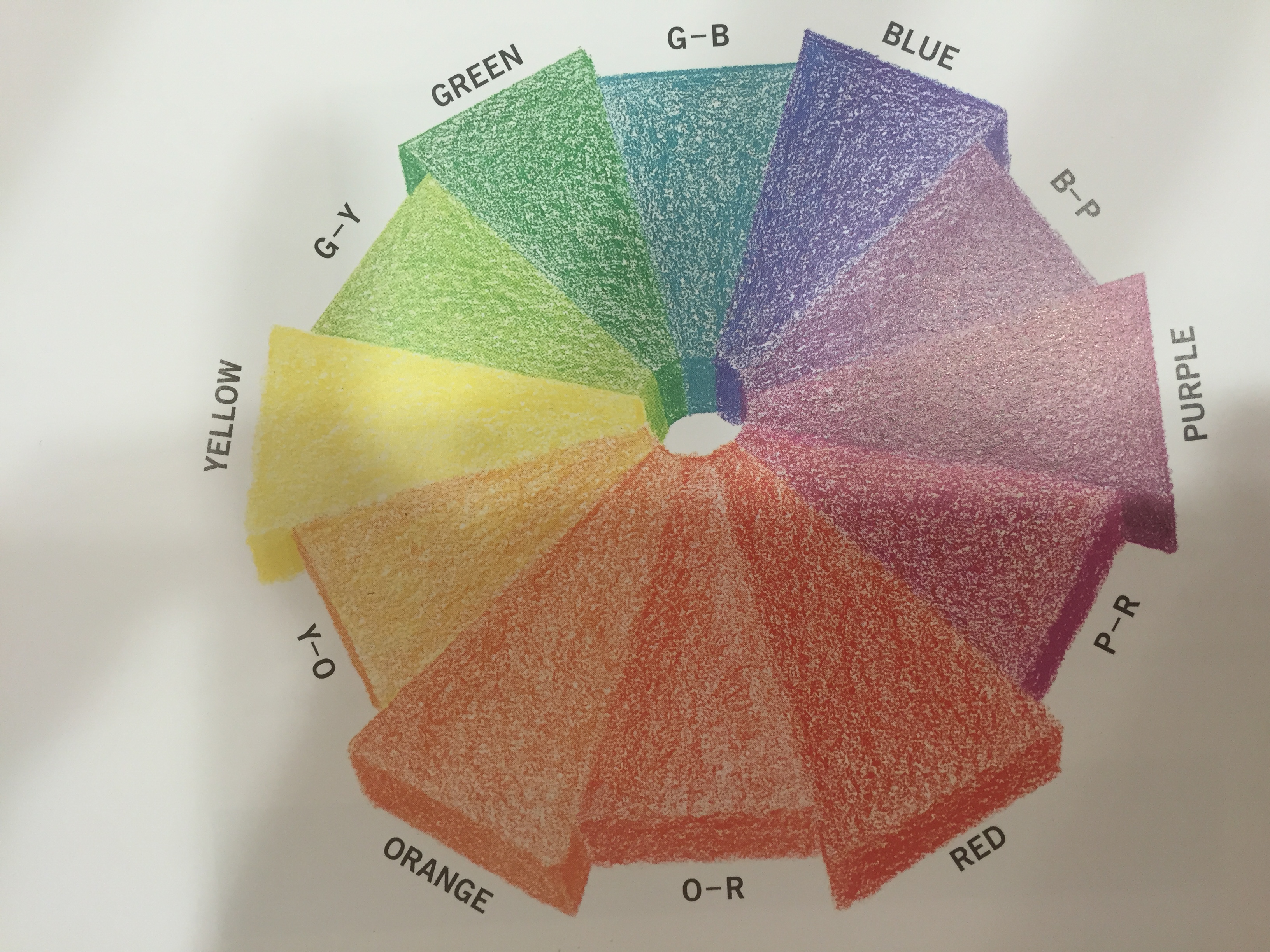
Color Hue is the first attribute to define. It represents the actual family name of a color, such as blue, green, yellow, red. The best visual aid is the basic color wheel. The most widely used wheel has twelve color gradations but the truth is there are an endless number of gradation possibilities between each color.

Color Value is most simply explained as the attribute that shows the relative lightness or darkness of the color by adding black or white.

Color Chroma is the purity or intensity of the shade’s saturation. This is achieved by the use of gray, not black or white. The value of the color is therefore not affected.
So now that you know how to accurately define color, let’s get to the meat and potatoes. How do you want to live with color? Do you want more or less of it? Do you crave a soft, soothing tranquility? Do you want to be enveloped in it? Do you want to feel a sensational surge of inspiration by it? Do you like a combination of contrast and color? So many questions with endless possibilities…like a kid in a candy store!
The three prominent color relationships are monotone, analogous, and complementary.

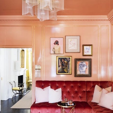
The monotone approach usually employs a neutral color scheme with various tints and shades within the same family of color.

Analogous color relationships develop a visual color scheme by enhancing the strength of neighboring but distinct hues.

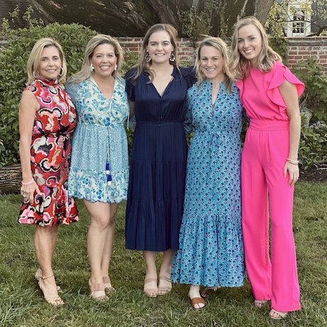
Complementary color stories apply the most daring approach by subscribing to the romantic ideal of opposites attract. Here is a little interesting thought to consider…a number of our favorite holidays have complementary color stories: July 4th, Halloween, Christmas! Those may not be our individual color choices but there must be something to the color theory that complementary color pairings evoke certain positive emotions within us all!
Finally here are three hints to use in your interiors tool box:

- About the studio
Alex Deringer and Courtney Cox combine their formal training in design and fashion with their renowned sense of style in Ivy Lane, a full-service interior design firm that curates casually elegant family dwellings that are elevated by a unique spark. Whether an entire house renovation or a one-room makeover, Alex and Courtney’s extensive experience and collaborative dynamic inform a successful design philosophy: thoroughly understand the client’s lifestyle, bring a thoughtful spatial perspective, and enliven the space with the freshest aesthetic interest.
309C Cameron Street
Alexandria, Virginia 22314
studio@ivylaneliving.com
703.566.6582