Behind the Design: The Shoe Hive’s Retail Refresh
We love a makeover story here at Stylebook. There is just something so compelling about a fresh look and the renewed energy it brings. But change doesn’t come about magically; it takes vision and a thoughtful plan. Ivy Lane Living recently completed a fun project, a space that many Stylebook readers know (and love) well: The Shoe Hive! We thought it would be interesting to ask Elizabeth, owner of The Shoe Hive and The Hive, and the principals of Ivy Lane Living, Alex and Courtney, who oversaw the design process, what made this retail refresh a success.
Elizabeth, why did you want to refresh The Shoe Hive?
Elizabeth: We moved into our current space just after my son was born. Well, my son turns 10 this summer, which means it has been almost a decade since we had a new coat of paint or carpet. It was time for The Shoe Hive to get a little love, that was for sure. While I very much loved our original space, time takes its toll and things were looking worn out. I just finally had to face the music and figure out how to freshen up the place without closing much. I basically decided on a Tuesday and we painted a few days later.
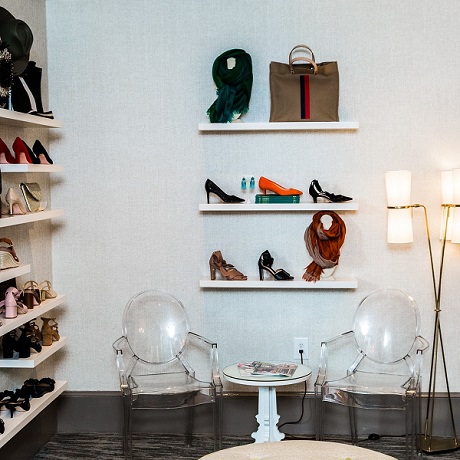
Before

After

So what overall “look and feel” did you tell Ivy Lane you were looking for?
Elizabeth: A little more elevated. And I wanted to lighten it up a bit. The Hive is so light and airy, I wanted the stores to have a more similar feel; they needed to complement each other. We had also wallpapered at The Hive about a year after moving in and the change was so dramatic I wanted to do the same at The Shoe Hive.
Alex, what changes, specifically, did you make to refresh the space?
Alex: The “lightening up” was accomplished by establishing a neutral palette then updating pretty much every, single surface. Exposed brick is a wonderful, architectural feature in the right space…but for this was no longer that space. By painting over the brick we were able to make an entire section of the store feel lighter and brighter.

Then we opted to use a deep, rich taupe paint for the trim. Now, this might seem counter-intuitive when trying to brighten a space. Why not white, right? Well, we knew that a contrasting trim would do few things: make the lighter walls pop, provide a defined framework around the store’s distinct spaces, and create a logical dialog with the trim on the exterior windows. This way space makes sense as you enter from the brick courtyard. The high-gloss finish on the trim also catches light nicely.
The new carpet, of course, is one of the most noticeable changes. The brown has given way to a multi-tonal gray in a sophisticated pattern that marries the wall and trim tones well.
Courtney: Going back to the store’s distinct spaces that Alex mentioned, Elizabeth wanted the side room to feel more like a family room, which required more than just a fresh coat of paint. We selected different seating, adding an ottoman. Everyone loves the ottoman! It’s super functional, of course, but not entirely expected in a retail space. It makes one feel welcome. The contrast piping adds a polished touch and suggests a tailored feel, so things still feel refined.


We also decided to go with lights that were smaller. These still make a statement, but the lamps are something you could see in a home, albeit it a very chic one. Bringing decor items you might expect in a home into a store is a way to make the shop feel like a comfortable, welcoming environment — it’s important to feel at ease when trying things on — yet the space is still very stylish.
The notion of evoking an “at-home” feeling makes me wonder: how is designing for a retail space different than designing for a home?
Alex: The design principles are the same. Scale, color, texture, lighting — all of these things need be balanced harmoniously so that’s pleasing to the eye and functional. That functionality, however, gets a bit more complex in a store. High traffic means that materials need to be durable, so that means commercial grade. And while historically commercial-grade meant — I’ll be blunt — ugly, happily things have progressed. We sourced indoor-outdoor fabrics that we are quite happy with, and you would never know the wallpaper is actually vinyl.

Speaking of wallpaper, Elizabeth mentioned she knew she wanted wallpaper to be part of the design. Can you tell us a bit about the decision process there?
Courtney: In any space, wallpaper is such a great way to add interest and texture. In The Shoe Hive in particular, we didn’t want to have the exact paper as The Hive, but we wanted them to feel related. That meant texture. We sourced one that has a heathered basketweave reminiscent of grass cloth. Interwoven is just a hint a metallic, which bounces the light in an interesting and engaging way…without being too glitzy.
Elizabeth: I loved the wallpaper at the store so much I just had it installed in the entry way to my home!

Elizabeth, why did you choose to work with Ivy Lane?
Elizabeth: I love their aesthetic, I wanted to use an Alexandria-based firm, and they are my great friends! Alex and I went to college together, and I have known Courtney basically since I moved here almost 20 years ago. She is the reason I am in retail, so it only made sense for her to help with the store.
Thanks, everyone! I adore The Shoe Hive’s new look.